STAFL SYSTEMS Fleet Management Platform
WIREFRAMES, MOCKUPS, USER FLOWS, PROTOTYPES & DESIGN SYSTEM
DISCIPLINE(S): UX/UI Design, Motion Design, Graphic Design
ROLE: Staff Experience Designer
SKILLS & TOOLS: Sketching, Illustrator, Photoshop, After Effects, HTML/CSS/Javascript, React
Stafl Fleet is a B2B software application that provides precise data regarding the status of batteries in a given customer’s electrified fleet of vehicles and/or stationary applications. It accomplishes this by remotely accessing CAN data stored in the cloud, or in real-time from the individual vehicle or stationary application by way of its installed Telematics Control Unit.
https://www.stafl-fleet.com/ ⭧
Problem/Opportunity
Renewable energy sources are forecast to continue displacing legacy sources, increasing market share, for the foreseeable future. Batteries are consequently a crucial component for providing power across all industries, and detailed battery insights will be critical in allowing entities to monitor and evaluate their battery fleet costs and make appropriate business decisions.
Typical battery solutions are not easily monitored, largely requiring physical proximity to access performance data. Battery systems that are not monitored are at a far greater likelihood to degrade and offer poor performance over time, up to and including costly repair/replacement.
Typical battery analysis solutions place minor importance on user experience.
Goal
Develop a software application that allows for remote access to battery data, both real-time and historical, normally accessible only through direct cable connection.
Capitalize on the competition’s weaknesses by presenting the product using friendly, competent, modern UX/UI, both in the application itself and in associated marketing materials/website, etc.
Impact
Stafl Fleet is currently being utilized by multiple major transportation/infrastructure companies to successfully evaluate the performance of their battery fleets.
An associated introductory website is live and available for marketing needs.
Kickoff
When I was first tasked with developing the UX/UI for the Stafl Fleet platform, the team consisted of only myself and my direct manager Erik, CEO of the company.
Two sources of inspiration informed, in broad terms, the goals for the system:
1. Extant CAN data analysis software, our main sources of competition
Erik was highly familiar with the landscape of CAN data analysis applications. He had accordingly identified a number of improvements which he believed could empower a superior application to compete with the players already on the field.
2. NASA’s Mission Control Center
A personal goal for Erik was for the company office to eventually feature a wall-encompassing monitor showing all the products being monitored by Stafl Fleet, in real-time. For him and for the company at large, this achievement would define a special kind of success.
Research
Interviews / Check-ins / Testing Sessions
CEO Erik has been a frequent, at-times daily, user of this type of software for over a decade and a half. He has therefore been our main source for research and insights regarding user experience and opportunities for disruption during the app prototype development and early soft-launch stages.
Following release of v1.0, the user pool was expanded to include other members of the Stafl Systems team as well as team members from our first client companies.
Competitive Product Usage+Analysis
I spent time exploring the CAN Data analysis software with which Erik was intimately familiar, so that we could proceed from the same page regarding those functional requirements.
Erik and I additionally spent time familiarizing ourselves with other distinctly Fleet Management-oriented applications on the market, collecting information regarding the state of the playing field, as well as features that we wanted to use for inspiration.
Key Takeaways
The field for battery fleet analysis applications represented a relatively consolidated market. Lack of competition had evidently slowed the implementation of a number of potentially monumental disruptors:
the capacity for remote use
a modern user experience & aesthetic
Internally, the proprietary Fleet App had the potential to dramatically save costs and time, as it would preclude the need for purchasing the competitors’ software and for costly trips to inspect company-monitored battery packs in person. Once developed and functioning as intended, the application would effectively ‘pay for itself’ in relatively little time.
Given the entrenched nature of the competition, it would be important to balance the desire to rethink major functional elements with the need to attract/retain users who would potentially be turned off by changes from the norm that were seemingly too radical or unnecessary.
Minimum functional requirements:
Allow company electrical engineers to remotely evaluate the health and performance characteristics of individual battery packs anywhere in a given battery-powered fleet.
A Line Chart element with all the same bells and whistles as those offered by the competition, plus our added enhancements.
A Map view to allow visual tracking of battery fleet units.
Allow electrical engineers to customize the layout of their company workspace in a manner that best fit their specific use case to maximize productivity.
A Dashboard with the ability for users to add / remove / reorganize / customize informational ‘widgets’ at will.
Wireframes & User Flows
I started by mapping out some thousand-foot impressions of the layout we believed would best suit the application goals.
Early on the decision was made to limit the app to desktop use, and we quickly keyed in on a standard layout that would be intuitive to long-time users of similar solutions.
Ideation & Prototyping
Together with our in-house full-stack developers, I set about putting together mockups to inform the initial creation of the Fleet prototype. Throughout the prototype build, I continued to drive visual and front-end coding decisions, informed by ongoing testing and frequent check-ins from our key stakeholders.
An insight that caused one of our biggest realignments was recognition of the importance of the CAN Data Analysis Line Chart. For a time this element was given less thought share in deference to other elements such as the Map view, but this situation was revised when it became clear that the Line Chart would generally receive a significantly greater amount of screen time.
Final Product
TOP LEFT: Units are presented in familiar List or Map views. Top-level Applications are first defined by the customer, with individual Units given hardware to report CAN data to the cloud
Thanks to the Telematics Control Unit installed within each customer vehicle or stationary application, CAN data previously only accessible via physical cable connection is made available anywhere in the world through the cloud.
Issues normally requiring in-person analysis and potential travel can now be addressed remotely, saving substantial resources and time.
The heart of the Stafl Fleet app is the “CAN Data Analysis” line chart. This powerful tool, accessible natively in any web browser, provides functionality currently only found in standalone rival desktop applications.
The line chart allows custom filtering, sorting, and visualization from hundreds of available input signals received from a unit’s battery
From Stafl Systems' website:
'The Fleet Management Platform can be used for both stationary and mobile battery applications using cellular connectivity. Improve productivity and reduce downtime with greater visibility into the status of each battery system or vehicle. Understand, in real-time, the state of any device in your fleet that uses Stafl Systems battery management or control technology.'
Design System Elements
Stafl Fleet follows a typical desktop app layout scheme, with an upper Status/Menu Bar, a left-oriented Navigation Bar, and main pages consisting of populated ‘Widget Canvases’ and context-dependent Modals.
Individual Widgets can be added, modified and deleted at will. The user can choose to visually elevate a given widget by placing it on a floating ‘card’, or have it blend into the background ‘Widget Canvas’, facilitating informational heirarchy and organization.
Modals contain the same ‘Widget Canvas’ body element found on main pages, capable of the same custom widget placements. Customizable Tabs allow for workspaces tailored to fit specific requirements. Unique to Modals is the ability to define an individual Widget as “Fullscreen” sized (Bottom Right).
Custom Icons
A large part of Stafl Fleet’s icon library is able to draw from well- and long-established standards. Nevertheless, built as it is for very specific and often esoteric purposes, the app also requires a large number of bespoke icons that convey functionality not found elsewhere.
TOP LEFT: Custom-built icons based on existing visual archetypes. TOP MIDDLE/RIGHT: Icons built from scratch for Stafl Fleet-specific purposes: Map Pins, View Options, Navigational Menu Elements & Line Chart Events
Icons built for use on the Data Analysis Line Chart:
1. Cursors
2. Full Resolution Data Request
3. Toggle Samples
4. Show Sample Values
5. Stack Plots
6. Overlay Plots
7. Sessions
8. Events
Widget Style Samples
Map
The Stafl Fleet Map blends unhindered functionality with a modern, clean and friendly aesthetic. The overall color scheme is rendered in light, desaturated tones so that the Unit Map Pins remain the focus of attention.
Stand-in Elements
Dummy branding elements custom-built as stand-ins for real customers. Dummy elements, a step beyond wireframes, allow for better assessment of visual aesthetics and functionality.
Continued Development:
User Experience Scenarios & Notes
Following the v1.0 soft-launch, continuing feedback from key stakeholders was essential in dialing the user experience right where we wanted it to be. These mockups were developed in Photoshop, bypassing structured wireframes and prototypes in order to prioritize speed. Clearly annotated for developers to understand UX/UI intent.
ℹ️ Click image or arrow controls to transition through slides.
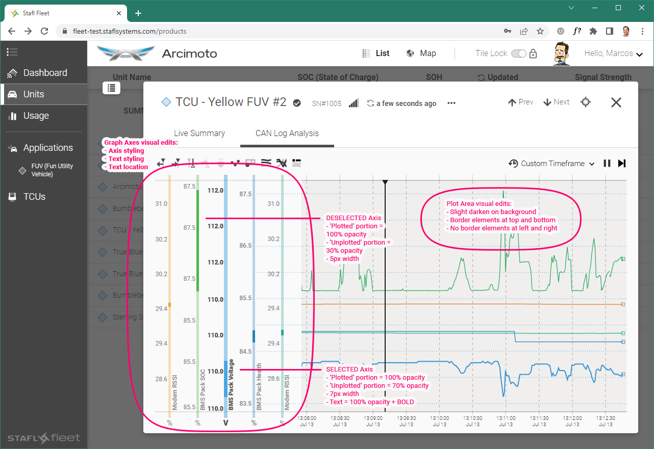
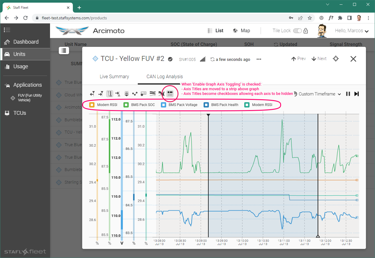
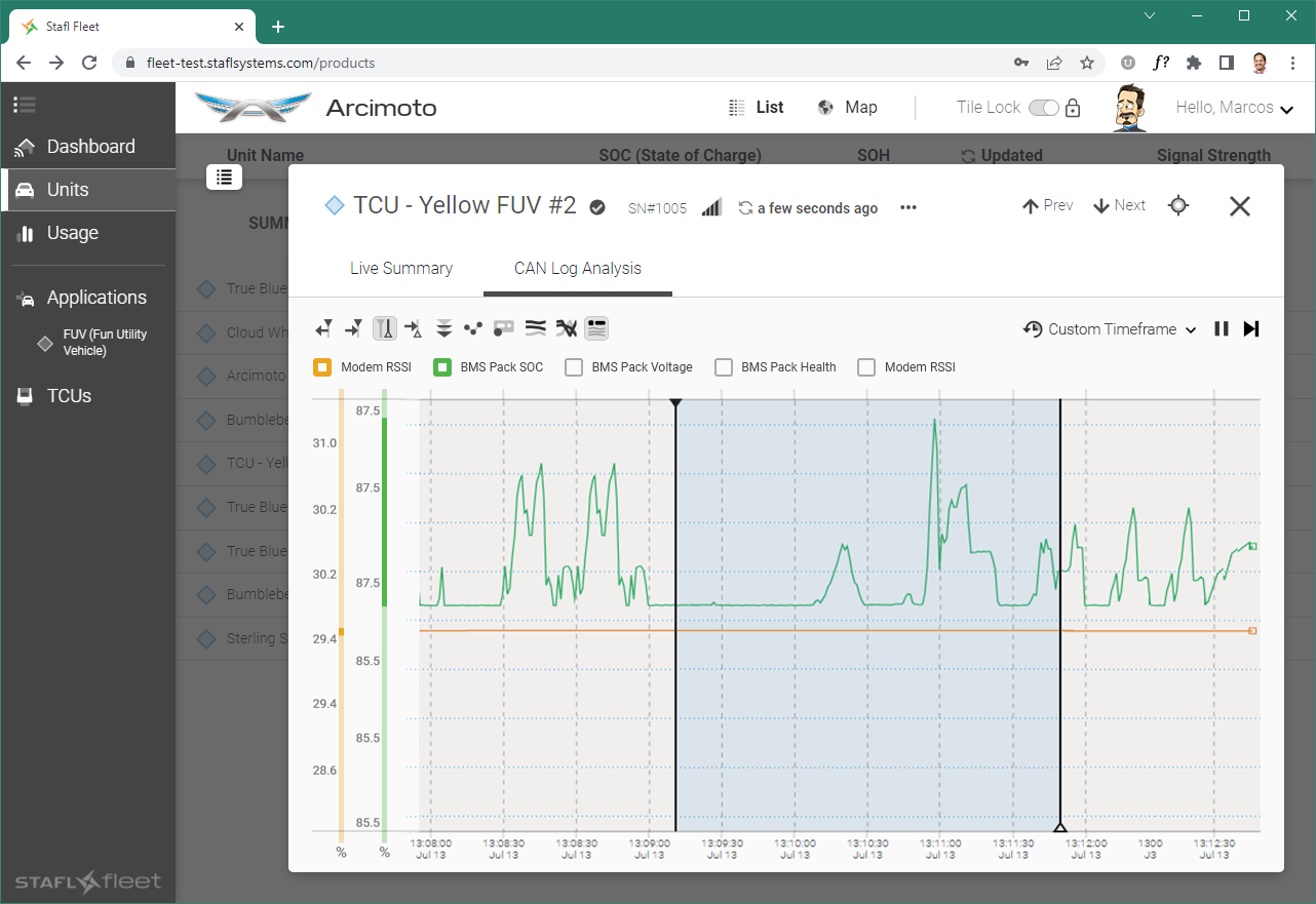
New Feature: Enable Selected Plot Toggle
With the Line Chart, space is always at a premium, and we strive to reduce UI elements as much as possible to make way for the plots.
This Solution allows unnecessary plots to be toggled and untoggled at will, without necessitating a modification of the Line Chart’s implementation settings.
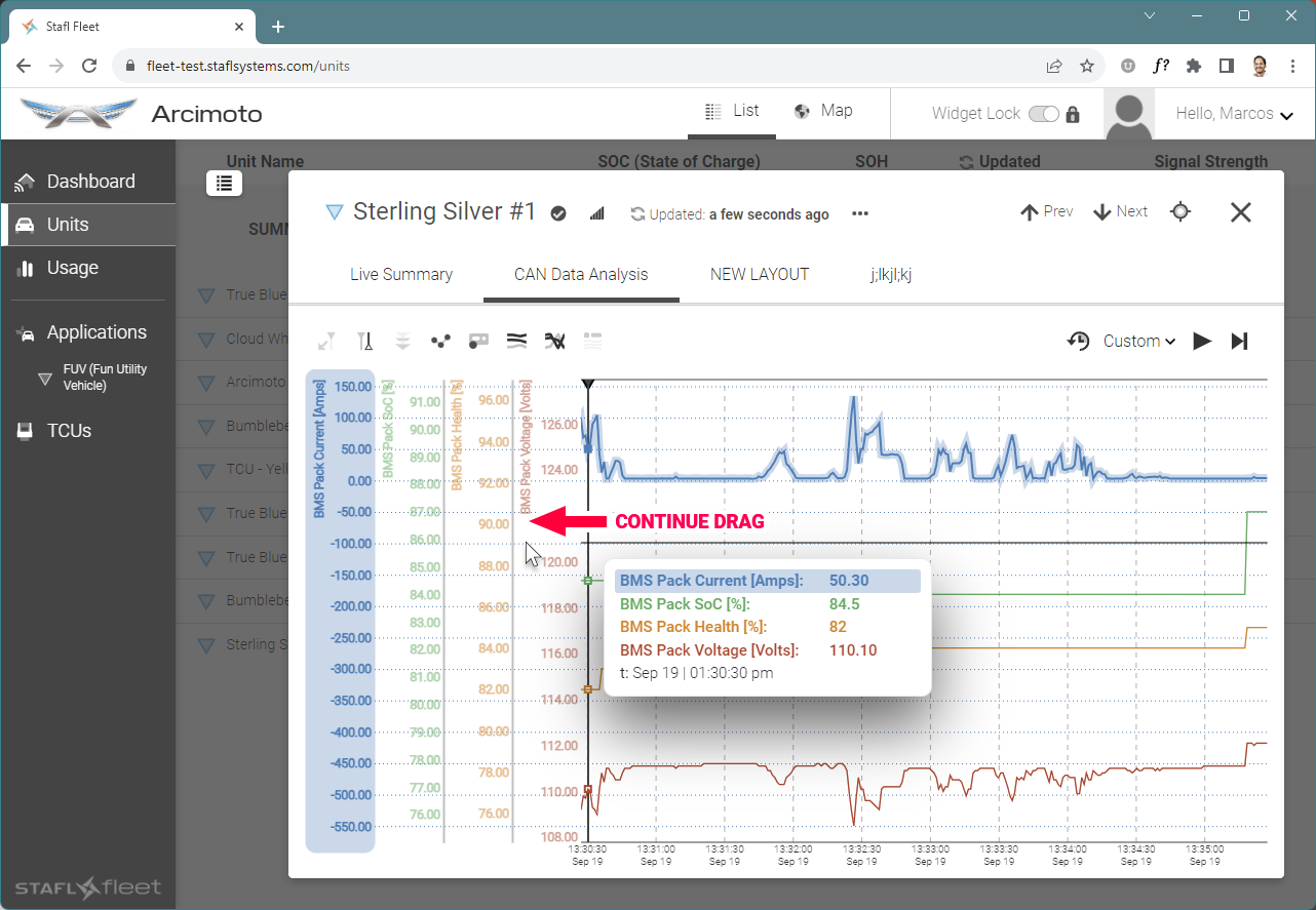
Behavior Adjustment: Dragging Measure Cursor scrolls the Plot Area
The Line Chart bears many similarities to the Timeline feature found on Video and Audio editing programs.
Being the equivalent to said programs’ ‘Playhead’ tool, we decided that our Measure Cursor should feature the same behavior of scrolling the Plot Area when dragged to either side.



Layout Design: Time-related information edits
Basic modifications to emphasize critical time-related information


Visual Design: Unit Tray to Unit Modal - Maximize/Minimize Animation
A simple animation developed to illustrate to the team the desired visual effect for this action.
New Feature: Sidebar (with Events, Map, Stacked Views)
The Telematics Control Unit within a given customer’s application sends a significant amount of data for viewing and study. ‘Events’ are a crucial tool in helping a user navigate to points of interest in the stream of data.
Additionally, it can be helpful to show a unit’s location on a map at a given point in time mirrored by the Line Chart’s Measure Cursor location.
These images illustrate the proposed Sidebar to contain these elements.


New Subdomain: Application Management Section, aka BRIDGE
Mockups illustrating layout structure and visual styling for a new section of the application.


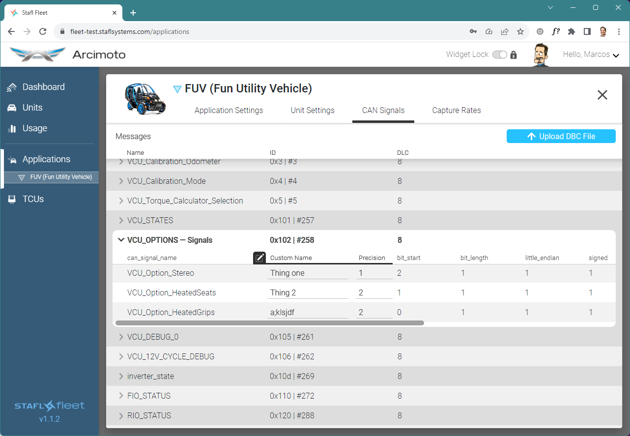
Behavior Definition: CAN Signals editing
Mockups illustrating layout structure and visual styling for a new section of the application.


New Feature: Enable minimizing/compressing of Line Chart Vertical Axes
An alternate method devised to maximize the visual space available to the Plot Area.


Behavior Definition: Line Chart Events Bar
The Telematics Control Unit within a given customer’s application sends a significant amount of data for viewing and study. ‘Events’ are a crucial tool in helping a user navigate to points of interest in the stream of data.
Events are displayed as icons atop the Line Chart in the ‘Events Bar’, and can overpopulate the designated area quite quickly.
These visuals illustrate to the programming team our proposed solutions to mitigate visual clutter.


Behavior Definition: Line Chart Sessions
It was determined that Events alone are not the most useful method for the user to navigate the data in the Line Chart.
More useful are ‘Sessions’ — periods of time, based on key events and other behaviors, that are known to have crucial data.


Behavior Definition: Measure Cursor Floating Tooltip
A quick animation illustrating intended behavior for the tooltip that appears when dragging the Measure Cursor.


![[VCD20190326]StaflSystemsFleetManagementTool_05-GreenMineral_01-BACK20191106-A-01.png](https://images.squarespace-cdn.com/content/v1/65f52bcd495164412a7003b2/1722630294012-HDGTGLBNMBS7UNJU57P6/%5BVCD20190326%5DStaflSystemsFleetManagementTool_05-GreenMineral_01-BACK20191106-A-01.png)
![[VCD20190326]StaflSystemsFleetManagementTool_05-GreenMineral_01-BACK20191106-B-01.png](https://images.squarespace-cdn.com/content/v1/65f52bcd495164412a7003b2/1722630305251-NA6TODY7VCLDZVO7PCWD/%5BVCD20190326%5DStaflSystemsFleetManagementTool_05-GreenMineral_01-BACK20191106-B-01.png)
![[VCD20190326]StaflSystemsFleetManagementTool_05-GreenMineral_01-BACK20191106-D-01.png](https://images.squarespace-cdn.com/content/v1/65f52bcd495164412a7003b2/1722630399633-YN073SO84Z45QYTX6SYP/%5BVCD20190326%5DStaflSystemsFleetManagementTool_05-GreenMineral_01-BACK20191106-D-01.png)

![[VCD20190326]StaflSystemsFleetManagementTool_03-PostBattShowLooksUpdate4_20191202a_03b-Graph.png](https://images.squarespace-cdn.com/content/v1/65f52bcd495164412a7003b2/1722640525425-YPROUGGARW9CDCK9LEB4/%5BVCD20190326%5DStaflSystemsFleetManagementTool_03-PostBattShowLooksUpdate4_20191202a_03b-Graph.png)


