GENOVATION Custom GUI Elements
VISUAL DESIGN LANGUAGE, MOCKUPS & PROTOTYPING, FINAL ASSETS
DISCIPLINES: UX/UI Design, Motion Design, Graphic Design
ROLE: Experience Design Lead
SKILLS & TOOLS: Sketching, Illustrator, Photoshop
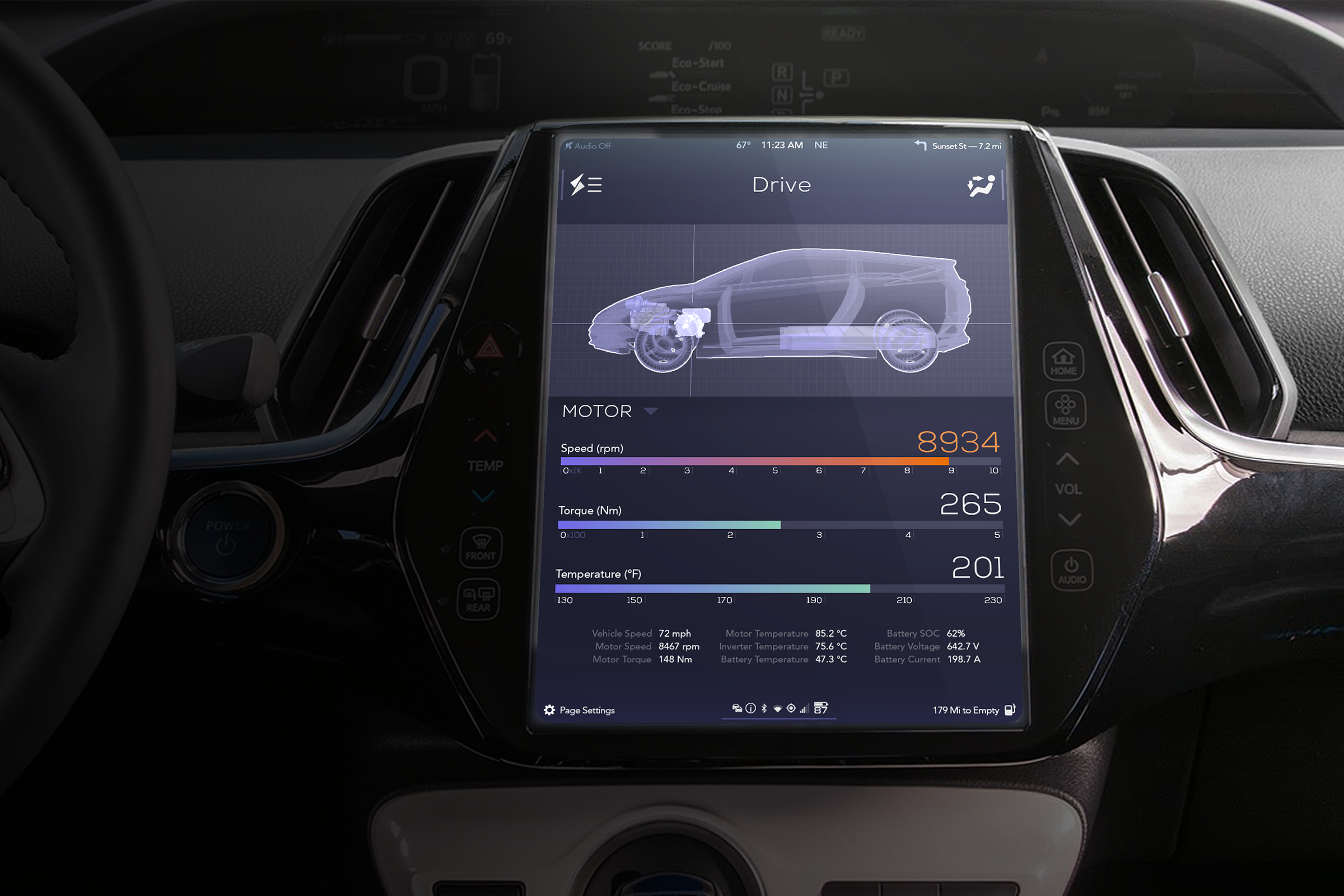
Genovation, an electric vehicle company based out of Rockville, Maryland, is in the process of finetuning the GXE: an all-electric conversion of the Chevy Corvette. A limited edition run, the GXE is meant to present the driver with a premium experience in every respect. Working for Stafl Systems, LLC in San Francisco, I was responsible for developing a dashboard infotainment system and dashboard gauges to replace the stock variants.
By replacing the stock dashboard gauges with a high resolution screen, complete user customizability of visual elements becomes achievable. To illustrate the possibilities, we developed three visual styles for the gauges.
Beyond properly satisfying UX concerns, this project had to balance several visual language variables. At the basic level, the user interface needed to evoke ideas of luxury and performance, elements common in all sports cars, while introducing elements that could be regarded as distinctly "Genovation". Beyond this, the interface also needed to blend in with the Corvette's established design language.
Adopting an understated but elegant visual style, the Genovation GUI employs a dark stage background, borrowing cues from the chrome accents found elsewhere in the Corvette interior design language and employing strategic touches of bright color to draw the eye.
ABOVE LEFT: As a high-performance electric vehicle, detailed battery information presented in an easy-to-understand way was a crucial requirement.
Preliminary Research
The early stages of the project encompassed two main tasks. The first of these was to modify the vehicle's interior CAD to accommodate a proposed larger screen. Early on, the decision was made to expand the screen size beyond that of the stock Corvette to accommodate a greater amount of visual information, and to afford the vehicle a more modern and premium user experience.
An early photo-manipulation illustrating the proposed shift from the stock screen to a larger one.
Analysis of the Corvette cockpit was conducted, using both in-the-field testing and a highly detailed 3D model, to determine how much real estate could realistically be diverted towards a larger screen. After settling upon a screen size, the interior CAD was then modified to house it, and a representative screenshot taken for use in GUI development.
LEFT: In-the-field analysis of possible screen real estate, and an early illustrative GUI prototype. RIGHT: At one point, a fairly tall screen was suggested, the top of which could serve as a section dedicated to track or other performance-specific data. In the end, a slightly more modest screen size was chosen ("only" twice the size of the stock screen).
The second main task was to research the current state of graphical UIs in the automotive and related fields. Different visual approaches were grouped by their unique visual and functional traits, and the efficacy with which similar approaches might embody Genovation's particular UI goals evaluated.
A "Kobayashi Chart", upon which the images above are superimposed, can provide a (somewhat generalized) guideline of descriptive words with which to assign different visual and functional approaches to any design-related project.
Ideation & Development
My first concepts focused on broader goals such as element placement and color palette, leaving the details somewhat rough. As work on the project progressed, different graphical elements began to take more detailed shape. The initial sporty, stark appearance presently made way for a darker, more elegant style.
A full set of screens, exploring an early look and feel.
One of the elements deemed most important for the Home Screen was a graphical representation of the vehicle, intended to relay status and performance updates in real-time.
A fair amount of time was devoted to defining the layout and visual appearance for the vehicle's heating, ventilation, and air conditioning (HVAC) system. The visual language developed and finalized for this section ended up serving as a guide to inform the remainder of the interface elements.
Earlier versions of the HVAC system featured an expandable "drawer"-type functionality. Eventually, this became a full-screen modal instead.
Alternate Appearance
An alternate appearance exploring a more "digital" look, ultimately retired in favor of the Final Product shown above.


